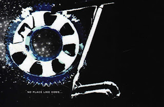
There's No Place Like..
I'm finally back from Florida after nearly a week of being gone! And I must say: "Thank the Powers that be!". Florida is quite frankly, one of the most mundane and slow paced places on the face of the galaxy, and I'm just happy to be back in the uptight and fast paced energy of the city. Phew!
So with that, I'm posting a couple of things. This actually hits close to home and I found really interesting. It's like a visual representation of Design evolution..
Back when I was a sophmore in High School, we did a show titled 'OZ'. The show was a darker, edgier version of the Wizard of OZ with a very industrial feel to it. Back then, I jumped into my premature designer boots and designed the posters and postcards for the show. Once that was done with, I thought I'd finished my adventures in 'OZ', but I was very mistaken. Two years later, as a senior, we were informed that we were going to be revisiting the show and bringing it Off-Browadway. Once again, I put on my little Designer Booties and tackled the new approach for 'OZ: A Twisted Musical'. This time, the show was to be much lighter and fluffier to cater to a more youthful audience. Now? Nearly 5 years later, the show is being ressurected to represent the USA in the Fringe Festival in Scotland. So after 5 years, and looking back at what i see now as horrible design work, I've been asked to design the new campaign work for the show. A mixture of both the old and new version, this show will feature an entirely new cast and have a very different energy as a result.
With all I've learned about design, I already felt the approach being much different. The experience was a lot more heightened and focused, and I went in with a very strategical idea of how I wanted to convey the story. The other previous campaigns had very little story and lacked substance, and I wanted the newer version to contain a sense of story and have a more relatable feel. Another particular point I wanted to make was to continue on with my fascination of "Old meets New" in terms of Design. I wanted to have a very sleek design that emulated the old musical posters of the 60's, in keeping with something that could look stylish now as well. I wanted the twister to give it that modern design feel and I think it did it's job in keeping it relevant. The type (which I'm still debating) was also chosen to emulate old meets new and feel like those older posters that had very condensed and blocky text to intensify the titles. I thought this would work, as the title is so short that it should stand out without looking as gaudy as I had previously done them.
Below is the work in progress version of the new poster, as well as the old school versions (that i'm very embarassed about in retrospect).
First Run (2000):
Second Run (2002):
Upcoming Run (2007):
Very odd..


3 comments:
Wow, I really like the 2007 OZ poster. I think you are successful in bringing more of the story element in this one, as opposed to you last two posters, which just seem to focus more on the word OZ.
Good job Laz, and welcome back! :-D
yeah man, that last poster is dope. I could see it become even more dramatic, but what you did speaks volumes.
Thanks Man!
Post a Comment