"How to Make Great Photographs"
Interesting (albeit long) article about how a good camera does not make a good photographer:
http://kenrockwell.com/tech/howto.htm
Interesting (albeit long) article about how a good camera does not make a good photographer:
http://kenrockwell.com/tech/howto.htm
Pretty good article that covers the very basics:
http://www.code-interactive.com/thinker/a112.html


Not exactly a logo, but i thought this was a nifty idea once i started playing with it.. :) I love fishes cause they're so delicious! Gotta Gold Fishin!

Identify all the things "wrong" with this "tutorial":
How to make an awesome logo
(The dumb title doesn't count).
And...GO!

I know it's "industrial" design- but the new MacBook is where it's at. No photo I have seen does it justice- go to an Apple store and check it out in person. The "fit and finish" of the Machine is well beyond anything I've seen. I owe a lot of it to the magnetic, non-mechanical latch- it closes so tight and cleanly. I've never thought a machine looked so cool closed. Now it's up to you to pick black or white- I pick black in this case. The white is shiny and fun, but it too iBookish- this machine is so far beyond iBook that the crazy matte black does it nicely.

This is what happens when you let a graphic artist get bored at work.. he draws blue naked women..

Im following in the tradition set by the high priestess Shalimar. I have created a doodle of what life can represent when im at work..lol..
Well, I suppose I better throw my own opinion into the ring. Here's my favorite picks for last years best movie posters:
10. The 40 Year-Old Virgin
There are four things that they did right with this poster: Eye-Catching color. Fantastic photo. Simple typography. And they actually used the poster as the DVD packaging- Good branding. I don't know anyone who doesn't at least giggle at this poster- even if they didn't like the movie. 
9. Rent
I know it's just a re-hash / re-imagining of the original Broadway artwork, but it REALLY draws the eye in. You just KNOW that people who are familiar with the play are going to gravitate towards this, and the people who weren't (like me) still were drawn toward it. The classic stencil works really well- The poster "Gets" the movie....You have different personalities and relationships and they're all represented nicely through color and placement.

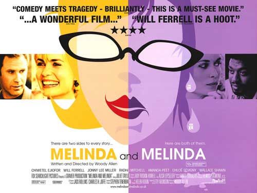
8. Melinda and Melinda
This is all about color, use of space, and a kickass graphic. The green, yellow, black and white all work in favor of this design. The typography kinda sucks, but that great graphic REALLY saves it. For an example of how wrong this concept could go, look at an earlier version of this poster here
7. Mad Hot Ballroom
On top of being a really great documentary, the poster really captures the feeling of the movie. A bunch of inner-city kids take ballroom dancing classes (do not confuse this with that Antonio Bandaras crap)- This is a recreation of one scene where the kids practice in the park after school. I think the sky, skyline, pose and type really bring this whole thing together nicely. There were a lot of movies in this past year that used the Manhattan skyline as a graphic, but this is the only one that really uses it to it's advantage- as a backdrop.
6. Me And You And Everyone We Know
This is a cute, albiet sexually deviant, film about, well, people. It does a nice job capturing a surreal reality. The poster carries that over well. I love the use of the soft pink, and the stright forward type. The image litterally reflects exactly what the title is- and in this case, I think that's ok.
5. Havoc
I have no idea what the movie is about- but this feels to me like the Rent poster if it was indy and done with a touch more style. That's a really nice Sans font- I wish I knew what it was- could be Gill Sans.
4. The Last Mogul: The Life and Times of Lew Wasserman
Dunno who Lew Wasserman is- but his movie poster sure is nifty. It really mirrors the Melinda and Melinda poster, right? Oh well. I think the line drawing of, what I can only assume is, Lew Wasserman is really cool. There's nothing like Helvetica on a nice spring day.
3. Walk the Line
On top of being a pretty damn good movie, I have to hand it to a major studio doing an artsy poster like this. Really captures the essence of Johnny Cash, and the use of old American wood type is great. Just a wonderfull, eye-catching graphic.
2. Breakfast on Pluto
Yet another movie I've never heard of. But does that surreal image not match that surreal title perfectly? I love the BRIGHT blue and the touch of BRIGHT pink mixed with a pinch of BRIGHT yellow, all off-set with a black iPod woman.
1. A Good Woman
I think I would hate this movie. I don't know why, but it doesn't look up my alley. But, the poster is just too damn cool. I LOVE the vector faces, the layout, the colors, and even the type. My only complaint is how they treated the type with dropshadows and gradients, I think it would have been stronger flat.
Bored with life? Well you've come to the right blog. Anyway, besides random posts, lets each try and design a logo for PID. Then, incorporating it into a splash banner for the top space. Tasteful, the banner has to to include the words Partners In Design and, Designers on Design. Yay boring. Besides that, post your doodles and random works of the day.


I think we may be doing some random things like this where each of us displays works in an almost compare/contrast way amongst the three of us. So I'm making the first move and starting something I'm going to call Double Take , where we take some redesigns of Movie Posters that we have done individually and compare them to their originals. Here are two I did a bit while back for the films Silent Hill & V For Vendetta.
Bored at work, so I doodled something on my Starbucks napkin. And I would like to share it with you.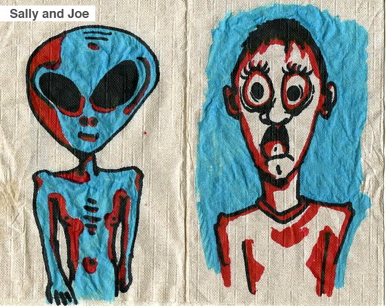
Hey everyone, I should probably introduce myself seeing that some people reading this blog may or may not know me or any of us for that matter. My name is Laz Marquez, I'm currently a Graphic Designer for two companies. The primary company is a cellphone software company called Scanbuy Inc. . The company specializes mostly in barcode scanning technology for your cellphones, and should eventually pick up here in the U.S. Aside from there, I also do freelance work for a Entertainment AD Agency in New York called 'Indika Designs' in which I work on various Movie Poster projects for various studios. We all have many other aspects to our personalities which I'm sure you'll pick up soon, so I'm gonna take this opportunity to segue into my first post's real subject matter.
In our boredom, Shally and I decided to rate our Top 10 Movie Posters of 2005, and eventually intrude on other years as we go along. So here it is:
Laz's Top 10 Movie Posters of 2005
10. Waiting
I absolutely love the clever way of displaying the film's subject matter and you get it right away. You understand what you're in for, and Thats something that is ultimately important to me. That a film's poster and marketing really expresses the film's tone and feel. The colors are strong and lively. The catchphrase works well too. 9. TheSkeleton Key
The close up details of this poster are amazing and the eeryness of the subtle eye imagery really sets the mood. The type treatment works with the title and it's subject matter. It takes a classier feel than most horror movies of this year and I love the decision to not include the headshot of the main actress. It's much more effective this way.
8. Memoirs of a Geisha
When i first saw this poster, I literally sat and stared at it for a good 10 minutes, just enjoying the beauty of it's subtle nature. It's a typical face image, dead on, but the composition is altered by the beautiful diagonal hair being blown in front of her face. It takes on an almost apinted quality, but does so in an elegance.
7. North Country
I dont analyze things as much as most people, or pick apart something as intensely. I know what me and my eyes like and I go with that. Call it unprofessional or without knowledge, but I have an understanding of whats good. This poster, many people didnt dig really. But something about it gives me the intensity the film is meant to express. It's desaturated, giving me the sense of desolation and emptyness. And the title treatment is a very harsh, cut up font which just aids the imagery enough without taking the foreground. It all comes together nicely.
6. Lord of War
I hate Nicholas Cage, so generally looking at his face makes me uneasy. BUT, this poster's illustration is detailed, complicated and successful in it's message. Thats all i have to say about this.
5. Happy Endings
I love the play on the title and the beautiful display of the body. It really takes something that could be a distraction and makes it a setting for the towel type treatment. I love the diagonal composition for the treatment and the allignment of the cast along the shadow of the spine.
4. Sin City
It's a comic book movie and they have done the best job at displaying a mix of the super stylistic qualities of the comic the film is based on with the realism it takes on as a film version. I've chosen this specific character poster because i felt the imagery was strong and beautiful. The mix of greys and desaturated color with the bright red quality of the lips and title are just gorgeous. It's very appealing visually. Love it.
3. Aeon Flux
I adored this campaign immediately. It mixes some amazing stylistic qualities but doesnt overdo it. It's a futurisitc blend of a broken wall bg that serves as a canvas for an almost graffitti version of Charlize Theron. The treatment is also displayed in such a sense that it pops up with unique futurism. I found this to be an effective way of showing this movie's different qualities and really making it's campaign a force of its own. Very powerful.![]()
2. Transamerica
This has to be one of the celeverist ways of tackling a very sensitive subject matter. It takes these stark, usually grotesque colors together, and makes them work somehow. This poster really hits me the most because it's highly iconic for an indie film and much thought was put into it's details. I love how the character is facing away from us. I love the subtle foot facing toward the male bathroom. It's very, very effective. And almost made my number one.
1. Everything is Illuminated
This is by far my favorite poster of 2005. The colors, the use of shape, the simple/complex imagery. It all comes together so neatly for something that could have been a grand old mess. It's just a stunning piece and my favorite part has to be the use of the billing block and the title treatment. It's very different and very clever. This is creative thinking at its best in my opinion.
---
So there it goes.. Woot Woot!
This is basically a blog, so we can post when we are bored as shit in the summer on the sidewalk. Lets use it to post Art and Design related BS. Work we like, dont like, our own work, etc. Even though we talk to eachother every day, we still need another distraction. Maybe we can create a following of distracted people, and lead them through the dessert of design freedom.
Laz and I are going to start with posting our Top 10 favorite movie posters of 2005. You can find the images at (www.impawards.com) Paul you should get in on it too.
Man we are lame.
Alright.
Over and Out.


