The Best & Worst of 2007 (so far)
Alright, so we're about half way into 2007, and since I have no work of my own to share with you, I figured I'd be a good time to give my nominations for the best and worst movie posters of 2007 (so far). I wont be listing "The Worst" in any order, since they all suck in some way.
The Worst
 Show Business: The Road To Broadway
Five posters in one! That's what this needed? This subject matter has a TON potential. Instead, we're looking at other posters, text effects, a really crappy picture of Times Square and a lot of drop shadows. Nice job blurring out the "Virgin Megastore" logo, it's SEAMLESS!
 Reno 911! Miami
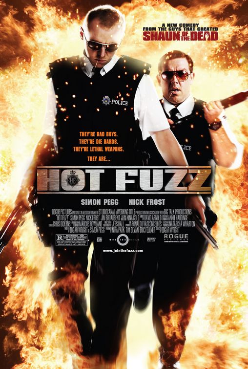
I think this list will prove that having all your actors in a poster is a dangerous line to walk. It can work, but not if you're simply expecting to Photoshop® them all into some sort of situation. It's not on either of my lists (because it's not super-great), but take a look at the Hot Fuzz poster for how this sort of genre could work.
 Next
NextWhat the hell was the brief on this? I swear, I feel like a computer could generate these "blockbuster" posters at this point. I could imagine what the software would be like: "Please enter actors name(s), desired color and movie title" "Fire? Y/N". There, done. (This is not to be confused with my mention of "Hot Fuzz" earlier, which was pretty much mocking this style of poster).
 The Hottest State
Can a single photo work as a poster? Sure! What if you apply a really lame Photoshop® filter to it? Maybe. But chances are, it'll end up like this. The text isn't a total cop-out, but it's not nearly good enough to save the image, which I swear was prepared by a 14-year-old.
 Tyler Perry's Daddy's Little Girls
I don't think the title of this film could be any more awkward. "Perry's Daddy's" is not an easy read no matter how you put it. I know it could technically be referred to as "Daddy's Little Girls", but I think if Tyler Perry is so dead-set on associating himself with everything he does, I'm going to be a pain in the ass about it. This poster sucks, too.
 Caffeine
Ooooo...this coffee house has attitude! Look at these hip people and their never-ending stream of gossip and manipulated typefaces! I guarantee that not only will I "believe the buzz", but I'll walk out on it, too.
 Brooklyn Rules
Alright! It's in Brooklyn! One image of the bridge will do just fine; and the collage of guys isn't doing anything, either. I'm also not quite sure what the hell the tag line, "Not Made To Be Broken" means. I've tried putting it together several ways, but it keeps ending up as a stupid sentence fragment that doesn't make any sense. ("Brooklyn rules not made to be broken" almost works, but falls short because it's dumb.) (Also, it's not my fault that Mena Suvari is in both this and Caffeine)
 Bratz
BratzOh, go to hell!
 Because I Said So
I almost didn't include this, because, in all fairness, it's not the official U.S. poster. But, then I realized, just because it's foreign doesn't mean it's got carte blanche to be friggin' ugly! Her face and arm are freakin' me out.
 August
Problems:
1) Too many effects
2) Type is too large, and reflecting on the "floor"
3) Josh Hartnett is a robot, and thus, shouldn't have facial hair.
 Are We Done Yet?
Why are they all looking at me? Even the raccoon is locking eyes! I think they're all amazed we're even looking at the poster.
The Best

Knocked Up
This movie has some "OK" posters. This one isn't the super-well designed, but the concept is too fun to ignore.
 The Borune Ultimatum
I really like the feel of this poster. The type is a bit boring, but it's simple and does the job. I'm impressed that it's very easy to identify Matt Damon by only the back of his head.

Superbad
I don't know what this film is about, but this poster caught my eye. The photo is perfect, and is an overall good example of how a photo with some type can create a nice poster.
 Teeth
TeethThere's something really uncomfortable about how this is laid out, but I think it matched the photo well. I believe it's meant to be uncomfortable. The photo has a nice touch of sexy, too.
 Grindhouse
It's all about style!
 Paris, Je T'Aime
What a gorgeous image, and a really classy poster. I love when they have fun with the billing block.
 Close To Home
This looks like the designer was given some crummy photos and told to make a poster. If thats the case, they did a wonderful job.
 Ocean's Thirteen
This is the second of three posters that have fun, rounded corners in the design. I'm not too excited about the film, but they clearly had a bit of fun designing this. If the border were cropped out, this would be a pretty average "group shot" poster, but everything around the edge saves this thing.
 My Kid Could Paint That
Art!
 El Camino De Lose Ingleses
This poster says "December 2006" as it's release date, but it's listed in the 2007 section of IMPAwards, so I'm going to allow this. I don't know what draws me to this poster, but I find it so elegant. There's a whole series of them, but I find this one to be the prettiest.


3 comments:
I like your list, it's really well compiled. ESPECIALLY the choices for bad movie posters. I completely agree with 'Show Business' and 'Next', which would be my choices for the most horrible film posters this year to date. The layout for these is so terrible, and there just isn't any cohessive visual composition. That, and Nicolas Cage makes me want to vomit.. dont star sell the guy.. it doesn't work.
As for your favorites, I'm not so sure I agree with you on 'The Bourne Ultimatum' and 'Superbad' as they just don't seem to pop out to me. The two of them lack any 'pop' and have very dull, central compositions that i dont feel say a single thing about what the film is about. 'el camino' is my favorite this year though, and i thank you for including it on your list. it's a gorgeous design and really was a stunning, welcome new sight when i first saw it.
I love El Camino. I think it's my favorite, and the runner ups are Paris, Je T'Aime, and Grindhouse.
Man, those in the worst category really bite! Who are they hiring to make these posters anyway?
The bad posters are in fact very bad. Your choice for the best posters to my design taste I'd say is a little more controversial. The Bourne Ultimatum, it is not a bad poster, and your right, you can tell its him from behind. It is very simple, and often the simplest explanation is the best one. But this one is simple and safe. They should have not included any title, or actor name. Just a billing block. Let the photo speak for itself. If the simplicity were really pushed to the farthest reaches of space then maybe this would deserve the "best" category. Besides that, it kind of bores me and is mediocre at best.
Superbad had lots of potential with the photo, because its funny. But the border is stupid and the type placement is uncomfortable.
Besides that, I like the other choices... but I dont know, I personally like the Bratz poster. ;-)
Post a Comment