Partners In Design

5.31.2007

Laz Picks the Best of 2007 (so far)

Following suit with Paul's post, I decided to Add some of my personal favorite movie poster designs to the mix. I would have included my list for horrible posters, but Paul pretty much covered them all with pure accuracy.. That Bratz poster is seriously a design demon spawn from design satan. So here are my picks:


American Crime
What I love about this poster is that it's really simple, especially for a film that includes two of indie's big stars right now. You would expect some crazy star sell, big head in the sky design, but the agency behind this one took a much more dramatic approach. The tagline is great and really gets me curious about the story. Just the contrast between the stark, hard look of Keener's eyes to the incredibly tragic, crying eyes of Page make me really feel the intensity of this film right off the bat.


Vacancy
Another example of how great a design can be when a studio doesn't force a huge star sell. I felt that this poster took what could have been a very generic, boring horror film poster and made it interesting and filled with a stylistic mood. You don't want to stay in that hotel. I love that the type is an incorporation with the overall visuals.
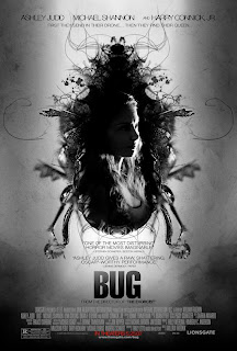


Bug
The less used poster of the two created by this design studio, this poster really jumped out at me. It's a very different composition for a movie like this, and although I'm not a fan of the shot (or any shot of Judd) being used, I feel the design of this bug is extremely elaborate. I love the monochromatic color pallate and the typography on the poster very much. It all works very cohessively and takes some risks in terms of the standards of one-sheets.


Year of the Dog
Where usually I dont find that this hand-drawn/photo incorporation works, this poster seems to do it right. I think it captures the film's idea very well and does a great graphic representation of the isolation and difference that our main character feels. I think the illustration aspect is very interesting and i love all of the cartoon representations of the film's stars. Very fun.


Mr. Brooks
This poster, as much as I initially wanted to hate it for being centralized and star sell, continues to wrap me up. Which means it's doing its job. Where this poster works for me, is the fantastic little square seperation detail. That really triggers the "hidden side/evil" aspect of the film and does it in a very graphic way that comes across clear, but looks fantastic. it allows for a typical star sell design to really stand out and catch the eye.


The Invasion
If there's simply one reason why this one is on my picks list it's this: It's fraggin creepy. This teaser does it's job of really giving me the chills through the sheer handwritten note tagline. It's mysterious and gets me curious about the film.


Good Luck Chuck
I saw this poster for the first time a couple of days ago and really fell in love with it. It breaks the rules of one-sheets in so many ways that it's almost hard not to appreciate it. First of all, the crop of that image is perfect, and the treatment they used is really fantastic. I love the low use of saturation on the poster and i love the simple usage of type to get the message across. It really is pretty funny and brilliant.


Fido
Simply put, this is just a great piece of design. I love the colors, love the logo, love the treatment to the photo. And i really appreciate how they laid out all of those press quotes. They make the design unique and powerful, and it's not often that a poster has incorporated the pull quotes as a working device in a one-sheet. So bravo to them.


Grindhouse: Planet Terror
Of all of the posters released for this film (which seems like a gazillion), this one really popped for me. The treatment gives it a natural grindouse/pulp feel, which takes the viewer back instantly.. but not too much where it looks outdated. The poster has a real sense of forward moving pulp style and utilizes that fantastic, modern photo of the heroine. Love the running mascara and the wide eyed look on her face. The yellow background is perfect and compliments the other colors fantastically. And c'mon, that tagline.. jeez...


Premonition
Now this is what it's all about. I distinctly remember being with Shalimar when i first saw this poster and I remember us both loving it instantly. This poster was definetly the standout for 2007 so far. Not only was it risky (attempting to not use Sandra Bullock's huge, photographed noggin), but it was a really ambitious design. It still boggles me that they managed to recreate Bullock's face (and accurately) with the placement of branches and flying birds. I think it was fantastically executed, gave the film a mood and mystey, and helped make a leap toward more forward moving design-ery choices in the way one-sheets are conceived. I love this one to death.. the studio rocked it.

Book Review: Stylepedia


After listening to Millman's "Design Matters" with Steven Heller (Yes, I know I cite her way too much.. I should be her publicist), I picked up the book that Heller and his wife just released, titled: "Stylepedia: A Guide to Graphic Design Mannerisms, Quirks, and Conceits". The book cross references, in alphabetical order, all of the major styles of modern design as we know it. I've barely gone through reading through each single style, but even flipping through it, you can see how rich in content and how well thought out the book's idea is.

Designed using the beautiful thumb tabs, the book builds up as you flip through it with a pleuthora of amazing looks. The styles included range from the simple, the common, the complex, and the artist based. I was so overtaken with all that there was to learn, that I literally went in and had to post-it every single style that i thought I wanted to go over thoroughly first. That's how much information there is.

Some of my favorites among the many were: Krueger (Barbara Krueger's influence on design styles), Futurism, Dada, Simple, Heroism (Those fantastic old 50's war posters), Big Idea, and Art Deco.

Overall, I think everyone should pick this book up. If you're a fine artist, a video production major, an animator, or a designer, this book just deals with mostly styles. It'd be a great resource in any sense and will really make a difference in the way I research my projects from now on. Let me know what you guys think if you decide to pick it up.

Typography Dancing

A while back Paul posted a dialogue from Pulp Fiction turned into an animated typographical expression of the scene in the movie. I loved it, and I still go back to that post on occasion to watch it again.

A friend of mine, Eugene Roytfeld- some of you have seen him at my parties, drinking all my booze- sent me a few videos after I sent him the Pulp Fiction one. They are all very similar but still very fun to watch and inspiring in many ways.


I am annoyed that this person disabled embedding.

Design Plagiarism

It is said that imitation is the ultimate form of flattery. But when does it stop being flattering and start being illegal. This is something that I have kept meaning to post, but I keep forgetting. I am now listening to the latest Debbie podcast with Steve Heller and it reminded me of an older podcast with my female designer crush Carin Goldberg.

She made a cover for The New York Times Magazine a while back. And a then (fairly recently) was totally ripped of by an automotive company. I believe she is taking legal action. I would like to open up a discussion on this situation. What your opinion is on the theft of her design and how far can one go when drawing inspiration from another artist/designer.

Debbie Millman

Paul and I saw this video together. It is a presentation Debbie Millman some designers in Canada.

"On Thursday, March 31st, 2005, the Alberta North chapter of the Graphic Designers of Canada hosted Debbie Millman of Sterling Brands in New York. Debbie visited to present “Design Stories from New York”."


Its over 2 hours I think. We enjoyed it, I basically experienced it with her class. This is like a really condensed version on her class.

So when you have time, just put it on and let it play in the background while you work.
http://abnorth.gdc.net/millman/

5.30.2007

The Best & Worst of 2007 (so far)

Alright, so we're about half way into 2007, and since I have no work of my own to share with you, I figured I'd be a good time to give my nominations for the best and worst movie posters of 2007 (so far). I wont be listing "The Worst" in any order, since they all suck in some way.

The Worst

Show Business: The Road To Broadway
Five posters in one! That's what this needed? This subject matter has a TON potential. Instead, we're looking at other posters, text effects, a really crappy picture of Times Square and a lot of drop shadows. Nice job blurring out the "Virgin Megastore" logo, it's SEAMLESS!


Reno 911! Miami
I think this list will prove that having all your actors in a poster is a dangerous line to walk. It can work, but not if you're simply expecting to Photoshop® them all into some sort of situation. It's not on either of my lists (because it's not super-great), but take a look at the Hot Fuzz poster for how this sort of genre could work.


Next
What the hell was the brief on this? I swear, I feel like a computer could generate these "blockbuster" posters at this point. I could imagine what the software would be like: "Please enter actors name(s), desired color and movie title" "Fire? Y/N". There, done. (This is not to be confused with my mention of "Hot Fuzz" earlier, which was pretty much mocking this style of poster).


The Hottest State
Can a single photo work as a poster? Sure! What if you apply a really lame Photoshop® filter to it? Maybe. But chances are, it'll end up like this. The text isn't a total cop-out, but it's not nearly good enough to save the image, which I swear was prepared by a 14-year-old.


Tyler Perry's Daddy's Little Girls
I don't think the title of this film could be any more awkward. "Perry's Daddy's" is not an easy read no matter how you put it. I know it could technically be referred to as "Daddy's Little Girls", but I think if Tyler Perry is so dead-set on associating himself with everything he does, I'm going to be a pain in the ass about it. This poster sucks, too.


Caffeine
Ooooo...this coffee house has attitude! Look at these hip people and their never-ending stream of gossip and manipulated typefaces! I guarantee that not only will I "believe the buzz", but I'll walk out on it, too.


Brooklyn Rules
Alright! It's in Brooklyn! One image of the bridge will do just fine; and the collage of guys isn't doing anything, either. I'm also not quite sure what the hell the tag line, "Not Made To Be Broken" means. I've tried putting it together several ways, but it keeps ending up as a stupid sentence fragment that doesn't make any sense. ("Brooklyn rules not made to be broken" almost works, but falls short because it's dumb.) (Also, it's not my fault that Mena Suvari is in both this and Caffeine)


Bratz
Oh, go to hell!


Because I Said So
I almost didn't include this, because, in all fairness, it's not the official U.S. poster. But, then I realized, just because it's foreign doesn't mean it's got carte blanche to be friggin' ugly! Her face and arm are freakin' me out.

August
Problems:
1) Too many effects
2) Type is too large, and reflecting on the "floor"
3) Josh Hartnett is a robot, and thus, shouldn't have facial hair.

Are We Done Yet?
Why are they all looking at me? Even the raccoon is locking eyes! I think they're all amazed we're even looking at the poster.


The Best


Knocked Up
This movie has some "OK" posters. This one isn't the super-well designed, but the concept is too fun to ignore.


The Borune Ultimatum
I really like the feel of this poster. The type is a bit boring, but it's simple and does the job. I'm impressed that it's very easy to identify Matt Damon by only the back of his head.


Superbad
I don't know what this film is about, but this poster caught my eye. The photo is perfect, and is an overall good example of how a photo with some type can create a nice poster.


Teeth
There's something really uncomfortable about how this is laid out, but I think it matched the photo well. I believe it's meant to be uncomfortable. The photo has a nice touch of sexy, too.


Grindhouse
It's all about style!


Paris, Je T'Aime
What a gorgeous image, and a really classy poster. I love when they have fun with the billing block.


Close To Home
This looks like the designer was given some crummy photos and told to make a poster. If thats the case, they did a wonderful job.


Ocean's Thirteen
This is the second of three posters that have fun, rounded corners in the design. I'm not too excited about the film, but they clearly had a bit of fun designing this. If the border were cropped out, this would be a pretty average "group shot" poster, but everything around the edge saves this thing.


My Kid Could Paint That
Art!


El Camino De Lose Ingleses
This poster says "December 2006" as it's release date, but it's listed in the 2007 section of IMPAwards, so I'm going to allow this. I don't know what draws me to this poster, but I find it so elegant. There's a whole series of them, but I find this one to be the prettiest.

Excitement Explosions

While doing my daily wooster read, I discovered that woostercollective is making a book for the 11 Spring Street show that took place back in December. And what made my brain explode for a second is that they are working with Paula Scher to make the book. I am geeking out about it.

Read more here

5.29.2007

Back-Flash

At least once a year, I try and get myself up and off to visit my old haunt, Philadelphia. A very cultural and artistically driven city, Philly always brings me down to earth and gives me a lot of time to reflect on my past, present, and future. I do this because I've always considered Philadelphia the first time I became the person I am today. Of course, there are exceptions and other factors, but that place really was the first time I was able to escape the social constrains of being back home. I was able to become who I was without scrutiny or fear. It's no surprise to some of you that I was very low on the popularity food chain, in fact, at times I was in the dog poop of acceptance. When college came and I went to a school and city where no one knew the old Laz, I was able to finally break loose and be myself. I owe that to Philly, and every year is a larger leap toward my aspirations as an artist and as a person.

This year was no different for me. I was able to look at this past year and reflect on what worked and what I learned, and what didn't work. Artistically (since this is an art blog), I took it upon myself to buy and start reading a gazillion design books (including the fantastic book Shal reccomended, "How to be a Graphic Designer without losing your soul."). Through this, I was able to find a lot of designer's point of views and further explore the ideas of creating personal views and statements in my work. If I have free time, why not begin making statements through design? I began to really understand that If i have opinions and views (Which I certainly have, and certainly get me into some trouble), I should use my abilities to my advantage and share them. For so long I've been accustomed to being silenced or fear opposition, and through the past three years, have learned that it is my srength among others. I have strong opinions and as harsh as they are, they are mine and mine alone. And sharing these thoughts are pivotal to my artform. It should not be limited to my fine arts.

I began reading quite a lot on several designers who share their views (Scher, Sagmeister, Kidd, Krueger) and began to be filled with inspirations. As I've spoken about the other designers, I want to elaborate on what i took from Chip Kidd, a fantastic graphic designer that has done a pleuthora of different design work over the years. What I found fascinating is that for such a long time, Kidd was afraid of utlizing things that naturally called out to him (Kidd was an avid comic book fan as a child, which explains his frequent pop art/noir/vintage style). Over time, it became his signature and strong suit because it was what had called out to him his entire life and ultimately was a part of who made him him. He began tapping into himself more and brought out those sensibilities, tastes, and visual interests from his childhood into his design. I related to this, as I too am very interested in those stylisitic qualities and always have been.

After all of this, and listening to Debbie Millman's 'Design Matters' interview with Steven Heller, author of 'Style Guide' and 'Anatomy of Design', I was struck with this intense curiosity to explore the nature of styles as a designer. It's became aparent to me that i never want to be limited by one particular style and want to be capable of utilizing all design styles. And although I'm sure at some point in my life something will become signature to my body of work as a designer, I would love to be as much of a chameleon as I can and experience all senses of the world of design.

Now before I stop this ranting post, I want to ask you guys something: Do you guys feel there is something about your artform (Design or otherwise) that sets you apart at this point? Something that you feel is signature to you? Or do you feel you're still to reach that point? I would really love to hear what you guys have to say about this, so please post about it.

Below are a few design studies I did based on mixing my favorite graphic design styles from the past ( My favorite is primarily 50's advertisements), My favorite subject matter, and some statements I have strong opinions and stances on.


5.25.2007

Incubus Fans Vs Modest Mouse Fans

A few months ago Inucbus had a contest that gave fans the opportunity to make a music video for the band. In my opinion the results were pretty mediocre and uninspired. Made me wish I had some talent for film, or had the time at that point to learn the software. But reading through Woostercollective.com today I found a music video made for Modest Mouse in a similar contest. This to me seems way more inspired and original. Here it is with the description straight from wc.com


"Myself and a couple have friends have entered the above into the Modest Mouse video competition. Using green screen footage provided by the band we cut a simple music video. We then degraded the images and printed out each frame sequentially. (all 4133 of them) We then nailed each "shot" of 50-100 posters to various structures and posts. Then using a digital SLR camera with a long exposure we frame by frame shot each poster. Oh, and theres a little video projection (again, frame by frame on the SLR) just to mix it up. There is no compositing, no shortcuts, just lots of blood, sweat and tears, and a huge Kinkos bill!".... Max

Texture Artist.

Hey there! I met a dude named david munz who's worked in the game business for many years. he's a wiz at photoshop, 3ds max and many other programs. If any of you 3d-ers ever need a guy for textures or even modeling characters, let me know and i'll swing it by him. Or if you guys like we can get him on PID, whatever works for you ;)

dunka!

Triggers.

A little something I put together in my off-time. I did two versions, as I wasn't quite sure of what intensity i wanted to go for.
I've been trying to work a lot more with type and the messages I'd like to get out there. I feel as though (especially after listening to Barbara Krueger of 'Design Matters'), I have a voice and I should use it. This is an experiment in doing that.


ETC.Magazine

On my off time at work, in between publications, we decided we should put together a fun, little magazine to aid us in learning a new program we'll be implementing. The program, inCopy, allows for editors to edit all type and text in the publication as the designers continue to put together the book's visuals. This really cuts down the wasted time that can occur when the editing process comes into effect, especially in such a high turnaround time enviorment. Although we haven't started working on it solidly, I began to design the magazine's content and proceeded to just get together as much of the structure as I possibly could. I'm not sure wether we'll still be using it, but I thought I'd share some of what i've done so far on it.


lincoln and mr pid

Color study of Abraham Lincoln. I want to do a larger illustration of him , and since there are no photographs of him in color, I am experimenting with possible combinations.Mr PID is sad because he dropped his favorite 3H pencil.

(Previously posted on flying neutrinos)

5.23.2007

Tablet


I am a loser.