Spiderman 3
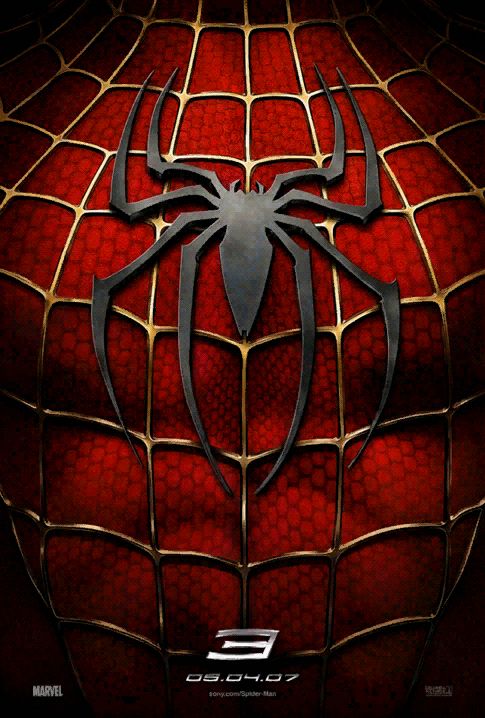
New Spiderman Posters have been released. And I thought it would only be propper to discuss how we feel about them.
I Kinda like them, they don't excite me much though as this one did.
But maybe thats just because Im not ready to be excited for spiderman 3. Anyway, talk amongst yourselves.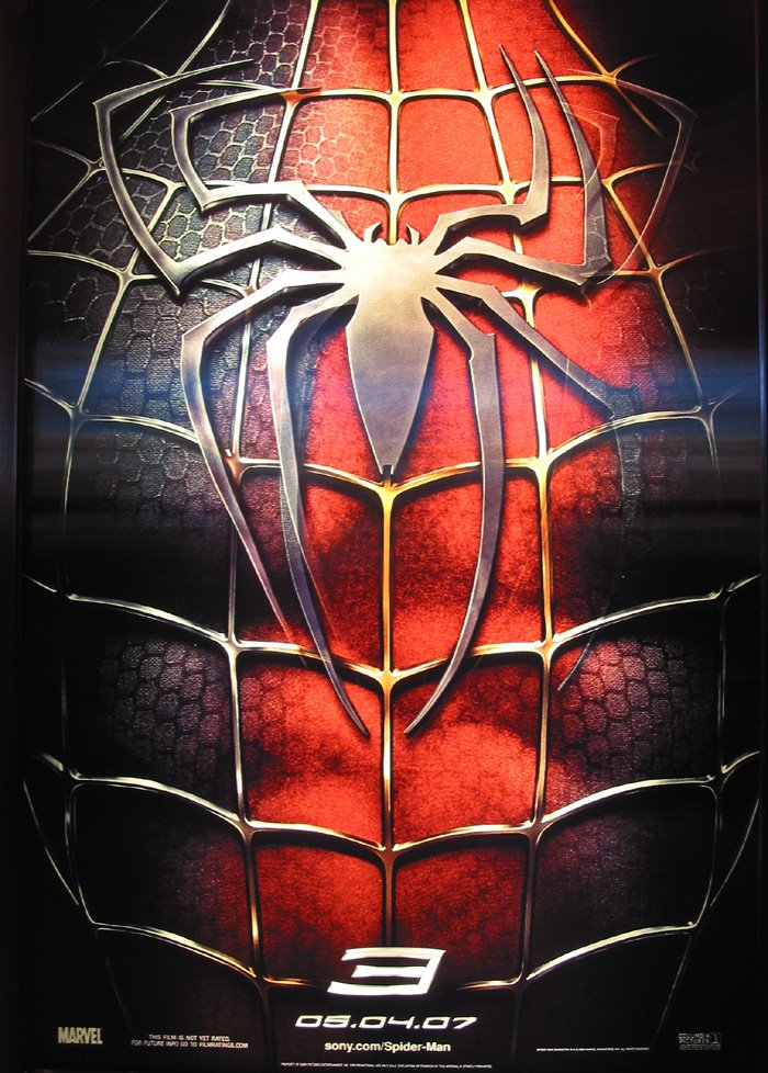


5 comments:
Can't say I'm a big fan of them really. I like the idea of the hologram one that changes depending on where you are, but the other ones dont work on their own very well.. they dont seem to give a clear enough message unless they're utilized together.. bad campaign, bad!
I agree, its well executed, and "pretty" but the concept is predicatble and weak. Then again, there isn't much they can do, as far as I know anyway. I am conceptually challanged.
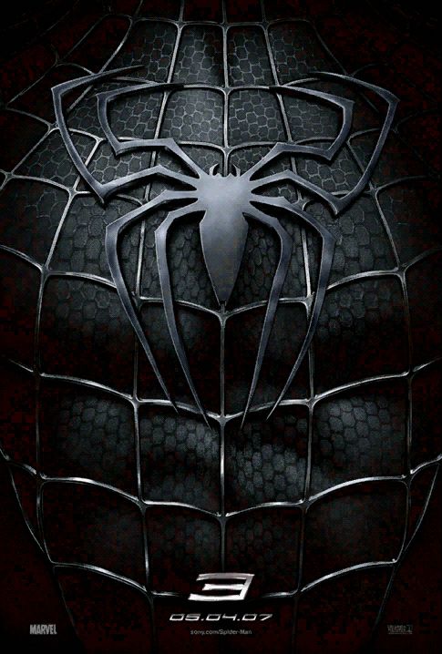
Not too bad- Like you said, predictable, but it would be insane to ignore the cool, graphic nature of the spidey outfit- especially with that wicked venom spider on one of them- I think it would be cooler if it wasn't so literally a "photo" of the chest- I think a good graphic spider web execution would serve well here- especially if you could play with it to communicate the inner turmoil he'll be going through in the movie.
Also, something to think about: Spiderman is a blockbuster franchise- They could do zero advertising and still have a record-breaking opening week.
Finally, look at the "Teaser" posters from Spider 2- They're just as obscure (Just spiderman, looking sideways with the number 2 at the bottom). The trailer posters, from later on in the campaign were the ones with all those ominous messages.
I agree with Paul. We should wait to see what the posters look like once we get closer to its release date. But I also think they should have tried something else for these. Seriously now.
hmmm.. i cant really agree with anyone really. the venom symbol is a little similar to the regular spidey symbol. and we're all pretty knowledgable about spidey so to us it's like "eh." but i bet all of you already saw the preview. bet you got a different reaction when you saw the symbiote blackness splashing over a very close-up zoom in of spidey's costume. that's even simpler but it got you didnt it? actually, the poster that's the all-black suit is just fine. it's the others that arent too big of a deal. but then again that's just my opinion.
Post a Comment