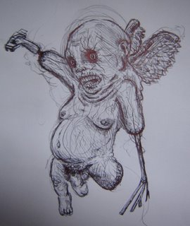
7.31.2006
hahahaha.. wait.. :(
this is sick. i know most of u are mac fans so you'll love this. try all the icons n stuff.
http://www.newgrounds.com/portal/view/182629
Designed By
Jarold Guzman
@
8:44 PM
1 Critiques
![]()
character
yeah lets just come up with a character i guess
Designed By
Jarold Guzman
@
12:17 PM
0
Critiques
![]()
Briar Rose
Hey, new version of the layout for my site. Changed location of the text and font type.. but then instead of making different variations.. I started doing the rose thing. Woop. 
Designed By
Alexandra
@
2:38 AM
4
Critiques
![]()
7.30.2006
New Painting

New Watercolor i did this morning after having some really intense dreams. I needed to ground my thoughts and create something pensive.
Designed By
Laz
@
2:34 PM
1 Critiques
![]()
7.29.2006
The Most Photorealistic Vector Art
These are some pretty crazy images made only in illustrator- they use the vector gradient mesh.
Click Here
Designed By
Paul
@
10:39 AM
1 Critiques
![]()
7.28.2006
Apocalypto

Apocalypto, a new movie coming out, by mel gibson. I am pretty indifferent about it, but if you havent already, I recommend you watch the trailer. And pause it at exactly 1:46. A little subliminal joke on mel gibson part. Which I think is funny.
Designed By
Shalimar
@
11:26 PM
0
Critiques
![]()
You said you'd keep me honest
OK so I am trying to get a layout going for my website. The one I never finish because I end up changing my mind. Yeah, that one. So here are some variations of what I am going for. I dunno... help? 

So yes!... I want to use those colors as the palette, but I have NO IDEA what to put on the right side of the image. Thus the diagonal German stripes. I was looking at everyone's sites, trying to get ideas. But none pop into my head. So if you have any suggestions, please share!
Designed By
Alexandra
@
4:16 PM
4
Critiques
![]()
7.27.2006
so...
has n e 1 thought of a character for the idea?if no one wants to, i can do it. i like makin up characters.
Designed By
Jarold Guzman
@
5:36 PM
1 Critiques
![]()
Meow.
I was bored today and finally got around to looking at this month's Fan Art Contest on Superherohype.com's Forums. The theme was to take one of your favorite superhero scenes (Movies, Comics, etc) and recreate it in your choice of medium. I immediately thought about "Batman Returns", which has some of my favorite Tim Burton-esque imagery in a Superhero movie, and chose one. I did this in a few hours. I sketched it, colored it, and took an image from the film for the Cat Logo. It's not perfect, but i ran out of time and entered it anyway. 
Designed By
Laz
@
4:31 PM
1 Critiques
![]()
7.26.2006
7.25.2006
Random Stuff
Long Monday, in class I made a few little sketches and stuff. All pretty random and silly. Just thought I would post em. 1.This is some silly olives with a head popping out the side. Makes no sense, no purpose, just wanted to play with my gold marker.
 2. I bought some spray paint at a store called Scrap Yard, its a special oil based spray paint. They have got some great colors, so this is just me playing with the paint seeing out the colors go together... and to make a funny face.
 3. This was a doodle i did in class today, makes no sense. And neither do the notes, dont bother reading them.
 4. This is a little more abstract. My teacher was showing us all these surreal paintings based on dreams, and I just kept taking elements of each picture and sketching as fast as I could. I made a mess, but its a fun surreal mess.
Designed By
Shalimar
@
1:40 AM
1 Critiques
![]()
7.24.2006
YAY!
AAAAAAAAALLRIGHT! we got enuff ppl to get sumthin goin so now for the brainstromin'. my SN is gzmnrd4j. we can all get together online sometime n talk shit thru. sum ideas i have is we make one big photoshop thingie of each of our styles. i dont have much to offer with photoshop so maybe we can do a flash colabo and submit it on Newgrounds.com. if n e of you dont know how 2 use it, u can send me pics and stuff u want in it and i'll throw it together. also i know paul's good with regular video so maybe we can do one of those. videos can play through flash too. laz is good with posters and stuff like that and characters so me n him can do those. shal is good at graphics so she can do like the menus and interactive stuff. alex is good w/ 3-d so we can throw that in there too. ooo! idea. we all put ideas for one main character that we can call OURS. then we can have him/her run through diff screens of diff styles. like he starts off vector(shal)... does some crazy shit and jumps off the side of the screen (or gets thrown off or falls off...) into like 3-d (alex) and runs around there and ends up in a comic book type world. (laz) and if anyone has the balls, they can dress up like the character and do a live action video (paul) that goes into like an anime world (me) then ends up on white paper and splits into 5 versions of himself. each is our own drawings of the character done how WE want then it ends. just a small idea.
suggestions? comments? lemme know....
jarold
Designed By
Jarold Guzman
@
5:09 PM
7
Critiques
![]()
7.23.2006
idea! OI!
hey everyone, jarold here. i'd like to propose something. i go through this blog frequently (i'd say at LEAST once a day. i like how everyone's got something different to offer and no one does the same stuff. alot of creativity. anywho, what i want to prpose is that maybe we can take all of our styles or skills and make a colaboration of something. havent thought of that yet... some things come to mind but i want to wait and see if anyone's interested. obviously we'd hafta do computer art or something we can do through the computer.
so if anyone's interested please leave a comment to this post.
thanks ;)
-jarold
Designed By
Jarold Guzman
@
1:20 AM
4
Critiques
![]()
7.22.2006
Grandfather/Grandson
Since everyone's posting so much, I feel like i need to over compensate..lol..
Here are some Works by my grandfather, In watercolor in the 60's. I dont remember him too much, but I know he was an artist and this is the first of his works I've really seen in person.. I had thought he only did Cathedral paintings and watercolor paintings, but it turns out he also did a lot of abstract art as well.. I thought it was eerie the similarities that showed up in some of our stuff.. just judging from his three pieces.. It was wiiiiierdd.. so here it is:
Abuelo:


Laz:


Designed By
Laz
@
11:12 AM
2
Critiques
![]()
Stuff I found in the attic folder
Oh looksit! I found more vector thingys I was working on. Some are still incomplete because I either forget, or move on, or most likely forget. 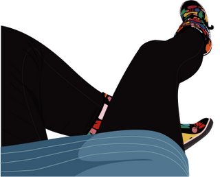


Designed By
Alexandra
@
12:31 AM
3
Critiques
![]()
Vanity at its best
Shalimar's prolific spewing of art and blogs has inspired me to post my current works in progress. I'm working on my website layout (for the nth time), so for the new layout I want to incorporate my self portrait. Here it is... 
I still need to add more shading to the jacket and hair. And a background perhaps. I am also working on two portraits of my parents, so once those are done I will post those as well.
Designed By
Alexandra
@
12:14 AM
1 Critiques
![]()
7.21.2006
More Olives
You guys must think im out of my mind. But I don't know what has come over me. I just feel like drawing weird things, things uncharacteristic of me. Today I went to a graffiti supply store in China Town, and bought some really fat thick paint markers and fun spray paint, and I decided to create my olives on plexi glass. Taking a picture of this was tough because of the bad light in my apartment and the fact that its on plexi. It looks alot better in Person.

Olive Invasion
Acrylic, Spray Paint, Paint Marker On Plexi Glass.
Designed By
Shalimar
@
11:33 PM
2
Critiques
![]()
Best logo redesigns of 2006?
Interesting (subjective) article on the "best" logo redesigns of 2006 (so far)
Best Logos of 2006
Click on each logo for more info.
Designed By
Paul
@
11:21 PM
0
Critiques
![]()
unterzeeboot
hey check out my latest flash mini. it took me years to get it done and even longer for the script. it's well-balanced, fine tuned and... well alot of hard work went into it. so have a seat (even though you only need the edge) and prepare yourself for what ebert considers to be the movie of this millenium.
enjoy.
http://www.newgrounds.com/portal/view/326336
"they should make a religioin based on this movie."
-Shaquille O'neil a.k.a "SHAQ"
Designed By
Jarold Guzman
@
6:18 PM
2
Critiques
![]()
Onionhead
#1. The Fall
Designed By
Shalimar
@
5:59 PM
3
Critiques
![]()
Extinction.
I was bored at work and decided to use a screencap I found of Milla Jovovich in Resident Evil:Extinction to make a teaser poster/poster for the film. The film takes place as Alice and her cohorts hide out in the Western Deserts from the Umbrella Corporation that is trying to get their number one weapon back. The poster isnt done yet, as i still have to put copy, the billing block, and title treatment.. but this is it so far :) 
Designed By
Laz
@
3:56 PM
1 Critiques
![]()
Life, Design, and Blogs
Hi All, Just wanted to let you know that My website is back from the dead. I paid my bill. YAY. I also fixed the blog, added more links, and invited a new member. Its been busy for the blog.
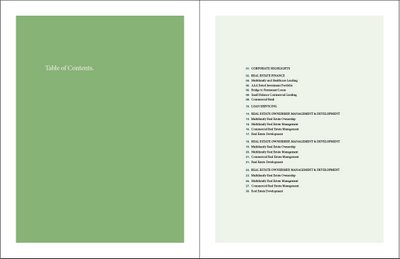
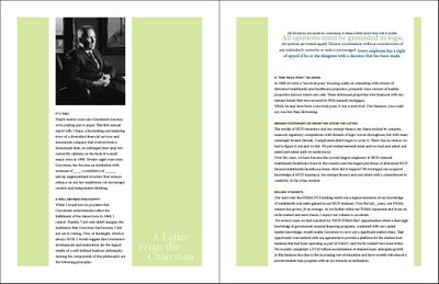
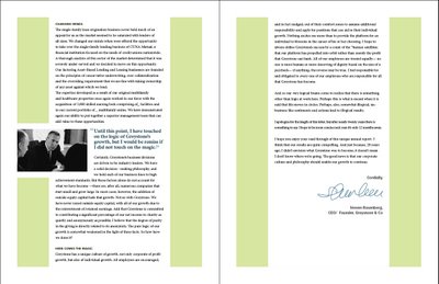
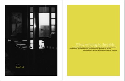
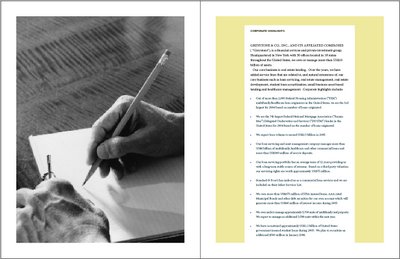
Some of you know that I have been working on this Huge Annual Report project for the past month or so. We recently had a meeting with the CEO of the company, and he hated what I did. Well, not really what I did, because the designs was not my idea really. My boss gave me doodles and asked me to interpret them. But I am not saying its not my fault, just not 100% my fault. About 25% my fault, for not interpreting them better. So now he is bring 2 other designers, 20 year veteran designers on the project, and he is going to see who can do better. Now, what the fudge, lets talk about competition. I really don't want to lose this project, I CAN'T afford to lose it, its my main source of income for the next few months. The CEO said he wanted something more edgy and happy then we did before (click here to see the crap fest). So, I have been working on something, its sort of a mini presentation to show my creative director saying "Pick me, I still have talent even though I am an infant)
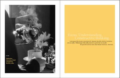
And here is what I have been working on so far. He was trying to tell this story with pictures, and now I am trying to do the same, but with more experimental type, and usage of color. I changed the grid to an odd number grid, and have expanded the color palette. The colors I am using now are to represent "Morning" and as my book progresses they will reflect the different times of day the black and white pictures represent. ANYWAY, here is what I have been doing. It is in NO WAY refined, think of them as digital thumbnails.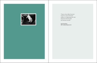
Designed By
Shalimar
@
9:39 AM
1 Critiques
![]()
New Partner
We Are expanding, and its exciting. Id like for you all to welcome, Monica Velasquez. I went to North Bergen High with her, and she is a recent grad from Art Institute of Philly. Check out her website.
Farewell
Shalimundo
Designed By
Shalimar
@
2:08 AM
1 Critiques
![]()
7.19.2006
Beauty is...
Photoshop. See, everyone can be pretty with a little photoshop and some patience.. Those models? They're probably looking like death in fron of the camera before we see them on the cover of a magazine or poster. Isn't it nice to know that anyone can be a pretty magazine cover model? LOL.. stupid society..
Here's a photo retouch for a stupid project i'm doing at my corporate job.. fun eh?

Designed By
Laz
@
5:46 PM
1 Critiques
![]()
7.17.2006
Running With Sissors

I was browsing for something interesting to post, and I came across this poster for Running With Sissors, I am not sure what the movie is about, but i think this is a fun poster, and kind of dicturbing.
Designed By
Shalimar
@
11:40 PM
0
Critiques
![]()
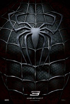
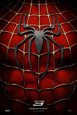
Spiderman 3
New Spiderman Posters have been released. And I thought it would only be propper to discuss how we feel about them.
I Kinda like them, they don't excite me much though as this one did.
But maybe thats just because Im not ready to be excited for spiderman 3. Anyway, talk amongst yourselves.
Designed By
Shalimar
@
10:44 AM
5
Critiques
![]()
7.16.2006
Armsrock: Sketch Book
I was looking on Wooster Collective, and they had this post, a video of a guy sketching. I always liked watching people draw. He draws this girl so effortlessly. Click Here to see the original Posts.
Designed By
Shalimar
@
12:36 PM
1 Critiques
![]()
7.15.2006
Funtastic Links
Paul compiled a list of links with resources, blogs, sources of inspiration relating to design, illustration, and other forms of art. Very Fun. But he was too lazy to post them him self. He is twatastic.
Here are some quick picks from it.
Bookmarks.
Big Machine - Motion Graphics
USSR Posters - Graphic Design
Brands of the World - Any Logo In EPS Format (Free)
AIGA Design Archives - Award Winning Designs
Adam Swab - Portfolio, Motion Graphics, Design, Animation
Any Many More...
Pauls List
:-)
Designed By
Shalimar
@
11:06 PM
1 Critiques
![]()
Vector Portraits
I was productive today, well, i was Yesterday too, but I was today as well, two days in a row, how amazing is that. Anyway, here are the icons I did, one of the guys already posted it too his blog. Which was fun. Here.

Designed By
Shalimar
@
7:07 PM
2
Critiques
![]()


