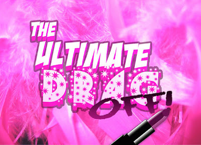
'The UIltimate Drag Off' / Comps
I'm doing some work for a friend who's revisiting a show he did a couple of years ago titled: 'The Ultimate Drag Off'. The show, which centers around a game-show like scenario, has a revolving trio of drag queen contestants who on a nightly basis for the title of the Ultimate Drag Queen. The show is an interesting premise, and a few years ago, I did the initial show design. The design was meant to be very kitschy/gameshow/flashy. This time around, the director wanted to go a different route, a much more concise,modern feel. Initially he had wanted to go very similar in logo to the first design, but I tend to not re-use old design elements, as I've learned so much more in the last couple of years. I felt it could be worked upon. Below is the initial design used, then three preliminary options for postcard imagery. Each has it's own distinct take, although none are done, these are the directions I'd like to take it.
Initial Design:
New Concepts:


8 comments:
I love the last one!
I really like the first one with the Barbie dolls in pieces. The last one is also an attention-grabber.
I agree that you should also revamp logos/designs instead of always going back to the original one. Makes for more interesting design.
it's actually pretty funny guys, because i hate the last one. the one with just the logo and the background.. there's something about it that bothers me.
very peculiar you'd both like that one.
The first one doesn't engage me at all. The concept is interesting, but the layout is blah. I find your color choice for the text hard to read, and the white background bores me.
The second one confuses me a little bit...the mannequins are cool, but they don't say 'drag' to me- the background seems superfluous. And on both of these- I'm not a fan of that font.
The last one embodies the event a lot more- it's got a great retro night-life feel with a hint of gaudy TV game show...it says a lot without any real visuals to speak of- the style IS the subtance. However, the different format you designed this in confuses me.
I like the barbie doll parts one. I agree with Paul, however the color choice for the text don't exactly make it jump out at you.
The mannequins one is by far my favorite, the variation in colors grabs the eye. I agree to a point it doesn't say 'Drag' enough but I think helps the goal of drawing people in, curiosity to exactly what it's all about. I think the ambiguity of the naked mannequins, as far as what they COULD look like when in drag, is a very smart way to go.
I don't care for the last one at all.. way too "Confessions on a Dance Floor"
Maybe I am alone on this but I like the font Laz used for the first two. I agree that the second one is more legible and doesn't get lost in the image of the Barbie. But the first one can be fixed by simply changing the color of the font. Or maybe using another font.
I really like the whole Barbie parts/mannequin idea. You should work with that a little more.
I like the third one. It is the type of card that I might pick up out of the piles of cards at a place like Kim's or Other Music. There is contrast to the foreground and the background and a hint of clean subversion to it, if you pardon the oxymoron. I can understand the background being a bit much but I like how it reminds of graphics that show up as "bug" on E! or other cable channels.
Let us know what you go with.
Post a Comment