Partners In Design v2
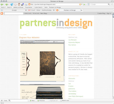
 Hello PIDerz. After almost two years of having the same layout. I woke up this morning with the itch to change it around. I still decided to keep the simple aesthetic but with a little bit more. Keeping the PID colors in the accents and adding some textures. Paul helped with background decisions. He and I are really happy with what came out. We thing it looks more like a pro-blog and its playful. Anyway, hope you enjoy it, at least more than the previous design.
Shal


2 comments:
Hey, good work on the new layout! It was about time to give PID a makeover!
I really like how it came out. The content pops so much more now.
Post a Comment