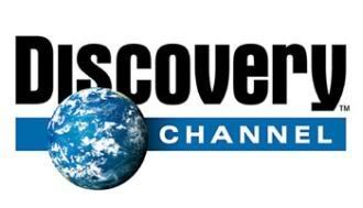
Discovery Channel Cleans Up It's Act
Just saw this on a bus shelter tonight. There's no instances of it on TV or their website yet...so I'm not sure when the official launch is.
This would seem to just about complete Discovery Networks' recent visual rebranding (TLC, Animal Planet, Science Channel, etc).

The old logo was definitely showing it's age, and I like the subtlety and simplicity of this new one- but the move to "Thin Sans" fonts by many rebranding efforts to portray "modern" is getting pretty "cookie cutterish".

UPDATE: They finally launched

This would seem to just about complete Discovery Networks' recent visual rebranding (TLC, Animal Planet, Science Channel, etc).

And for what it's worth, their digital signage was crashed at the time:
UPDATE: They finally launched


3 comments:
I am enjoying the new logo.
I don't like it... the font is no good and it looks like the discover card logo text :s
the placement of the globe is very strong... and the letter forms are very clean. overall, a very nice refinement.
Post a Comment