Marine Corps wide logo contest
I've been tasked by my sergeant Major to draw a new logo for the Single Marines Program. Marines from the east & west coast are gone submit their art. There will be 3 runners up from each coast. The last 6 drawings are going to be posted on a marine site for people to vote. My sighting said to me "Hey, Guzman, if you win you'll leave your mark permanently in the Marines." that would be very cool.
to make things cooler, this logo's ALL OVER the world on bases whether it be in magazines, newspapers, bowling alleys, clubs, theatres PX's (stores) etc... Basically anything that the SMP owns and operates. Here's what I'm going to submit. Hopefully I win. If I make it to the runners up I'll post a link n' maybe u guys can vote for me ;)
please tell me what u think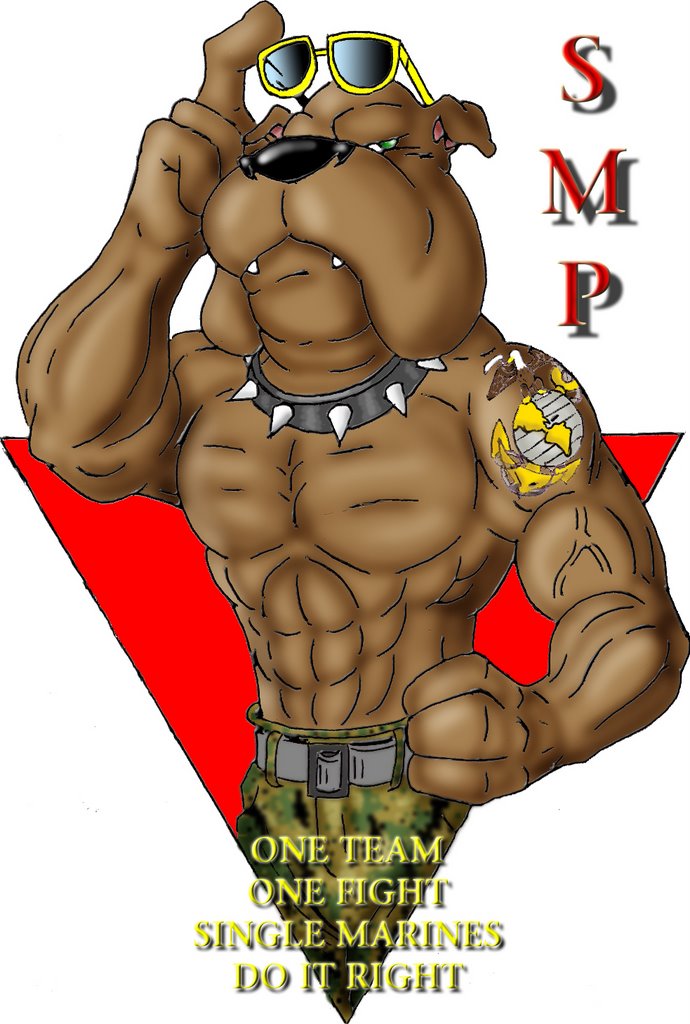
here's the old one for anyone who was curious... Oh you weren't? Damnit... Well here it is anyway


2 comments:
I love the drawing of the dog, its very cool. But when you think Logo you have to think about the symbolism behind it. Maybe its because I live in new york, and I am bombarded by it, but the upside down triangle just makes me thing of gayness. Haha. Anyway, the trick with a good logo, is usually that its simple, easy to read and symbolic. I do love the drawing, its alot better then the old dog, but the type isn't easy to read at all. If you have time, do some adjustments to it, make the type an easy to read font like Helvetica, or I guess Arial, i dont think you have any fancy fonts on your computer. So stick with the simplest thing, the drawing is already eye catching enough. Your headed in a good direction. Look up some of the best logos in the world, and you'll see they all have similar things in common. Abstracted shapes representing Ideas and easy to read text. Keep it up though, an ofcourse Ill voe for you.
woo hoo! u got it meng
Post a Comment