Partners In Design

4.06.2008

Lazy Sunday


In attempt to make my room prettier and use the frames that I bought like 2 months ago, i decided to take the day and create a graphic that would work nicely on the wall. Then printed it tiled it and framed it. They may not be perfectly straight on the wall, because i did it by myself with out a level or someone yelling "A little to the left" from across the room, but i think it'll do.

4.05.2008

Mustang Monoprints

Yesterday in my printmaking class, I made my first batch of monoprints. Basically, you work ink on plexiglass, and once you are done manipulating it, you transfer your result onto paper. It's a much more dynamic way of creating prints (compared to etching), and I find the process relaxing yet energizing. Although I still have to get used to moving the ink around with rollers and q-tips. Shalimar made an interesting comment about monoprints: she said she deeply respects artists that make art that will eventually be destroyed. It takes a strong individual to be able to keep making art, even with the knowledge that their art is at best temporary and at worst a faded memory. This printing technique surely tests those limits for me, and hopefully it will make me a better artist in the the long run.

4.04.2008

4.02.2008

KerPow!


3.31.2008

Discovery Channel Cleans Up It's Act

Just saw this on a bus shelter tonight. There's no instances of it on TV or their website yet...so I'm not sure when the official launch is.
This would seem to just about complete Discovery Networks' recent visual rebranding (TLC, Animal Planet, Science Channel, etc).


The old logo was definitely showing it's age, and I like the subtlety and simplicity of this new one- but the move to "Thin Sans" fonts by many rebranding efforts to portray "modern" is getting pretty "cookie cutterish".

And for what it's worth, their digital signage was crashed at the time:


UPDATE: They finally launched


Rogue Font

So, the other day, while walking to work, I noticed something quite strange. As about 32 cabs flew by me at high speed, I noticed one was not like the others. No, I'm not talking about the occasional off-color yellow that we find on some taxis. This was much more subtle.


Do we all remember this PID post from last year by Christina concerning the new NYC Taxi branding effort? One of the MANY central problems agreed upon by all was that adding the "chunky" NYC (global) brand to the centralized (yet equally confused) "Taxi" brand was creating a horrible mash-up of fonts and weights. Further research in to the branding effort of both the NYC campaign and the Taxi effort shows that there was a lot of earlier design struggle associated with the choice. The "NYC" style was glommed on later- in committee.

And then I see this...


From the best I can derive, this is the "pre committee" version of the taxi logo. It still sucks...no doubt (Baseline? Anyone?). But it's exactly 45% less sucky than the "final" version we see everywhere. I was unable to get an actual photo (the image above is from the NYC Visit commercial which has been running along with this campaign...clearly produced before the "glomming"), but I find this rogue font to be interesting none-the-less.

Comic Book Spotlight: Inspiration or Swiping?

So the past couple of weeks have been quite a doozy on editors over at Marvel Comics, but for reasons that are a little more complicated than one would anticipate. Just a few weeks ago, particular fans of Marvel went into an outrage over their realization that one of the upcoming issues of 'New Avengers', penciled by artist David Mack was overly 'inspired' artistically. The problem lies in that the artist seemed to blatantly steal the work of another artist in order to lay his panels out, which is what initially took the comic book fans by storm. But aside from the overt swiping of another artist's work, the man himself made a response to the issue, which enraged fans even more. Here are some excerpts to his 'process':

" thought it would be a subversive storytelling device to make each image of Daredevil based on an image of the actual Daredevil drawn in DD by DD artists. He'll look like DD but in the back of your mind you kind of think something is a little strange here. He's stiffer, he's smiling at the wrong
time...maybe in the back of your mind he's more like a mimic of the Daredevil you are used to seeing instead of the actual Daredevil comfortable in his own skin. That’s why I started with that iconic cover image of DD and even telegraphed it by using the similar buildings. You don't necessarily pick up on this immediately in the story, but maybe he seems to act and look a little off...and then when the reveal happens and you go back
and re-read the story, it dawns on you. That wasn't Daredevil at all, it was a copy of him. And that’s one of the reasons, I couldn’t speak on this until the issue came out."

"In this issue I was returning to the character, but
she was now an Avenger. A member of a super team, and
around a variety of super hero characters with a
multitude of abilities.
So I wanted her to be visually different this time. I
wanted her body language to feel colored by the
accents of all the other styles and super moves that
she would have absorbed. Where I had painted her
realistically before and drawn and painted her as a
variety of iconic fine art imagery throughout the ages
that she had absorbed, I now wanted to embrace the
comic book super hero aspect of her, and draw her in a
kind of iconic comic book style and figures. I didn't
want it to be overly glaring at first, but something
that would seem absorbed into her and that you would
catch after the fact. So, like I drew her in
references from my favorite fine art masters in the
past, I referenced her from some of my favorite comic
book artists in this story."
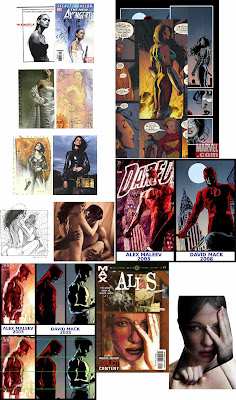


But as you can see in the images I posted above, there's a very thin line between what he mentions and what is reality in terms of one's work in comparison to another's. For instance, and many of you know this artist through posts on this blog, Greg Land has similarly gone through some major controversy for the same reason. Land has become infamous for taking photography and using it almost literally as reference. He, on the other hand, fesses up to it and creates some sexy covers in the process. Below is also a comparison of his work:


On an end note, the issue in question was a spectacularly written issue and played out beautifully. The art a bit inconsistent and the artist put the oddest schnoz on a latina character ever, but it was a great issue.

So PIDers, what are your thoughts on this?
Speak up!!

Super glue makes things finished.

This one is for u guys. Especially u, . ; D
I don't have my camera. It's somewhere else. So these were taken with crappy webcam.
High res pics someday...

3.30.2008

Old!

Old logo FTW

3.28.2008

PID Challenge: Fix The US Economy


If given the chance, how would you re-design the current collection of USD Federal Reserve Notes in an attempt to bolster the dollar's value?

Guidelines:
•The design must remain current 6"x2.5"
•Notes must include: Denomination, "The United States Of America", "Federal Reserve Note", Year, "This Note Is Legal Tender For All Debts Public and Private", "In God We Trust".
•Design one, two, or all the notes. Whatever meets your fancy.
•Security should be a consideration.
•Using any current design elements of the USD FRN is up to you.
•Design both sides!

Why is U.S. currency so effing boring?

So the new U.S. 5 dollar bill is now out in the wild....and it has a HUGE, purple helvetica 5 in the corner...so yeah...get them while they're HOT.


Meanwhile, Colourlovers has a great post rubbing the well-designed money of the world in our faces.

X-Files Teaser Poster

UPDATE

Man. I'm freaking Excited and I am enjoying this poster.

3.26.2008

Making The Juno Title Sequence

I stumbled on this cool Flickr set from the creators of the Juno title sequence: